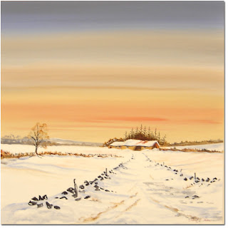
Keith Shaw's intense landscapes are painted in acrylic. He watercolour paints these blocky colours relatively quickly and spends time on the small detailed, intricate shapes/objects. Shown in other images, it's just vibrant colour backgrounds with small and detailed center focuses.
I like the how the colours are used - how they illuminate the picture - the way anything can stand out. I like the way he shows more sky than the ground/sea as he sees it as very interesting - just as much as anything else in the painting. The techniques used to create these skies are interesting and vivid and show a different side to landscapes. He contrasts all his paintings - the skies to the buildings - the sea to the objects around/in it - clouds to the buildings etc...
I like the how the colours are used - how they illuminate the picture - the way anything can stand out. I like the way he shows more sky than the ground/sea as he sees it as very interesting - just as much as anything else in the painting. The techniques used to create these skies are interesting and vivid and show a different side to landscapes. He contrasts all his paintings - the skies to the buildings - the sea to the objects around/in it - clouds to the buildings etc...
He captures emotion in the way he paints - like a photograph - an instant with feeling - calmness - loneliness - peace.
KURT JACKSON - UK Acrylic Artist
With a smilar perspective to Keith Shaw's paintings - Kurt Jackson paints these massive paintings on location - a different method gives different techniques - this is acrylic and is painted over a long times so the scene is not in an instant like Keith Shaw's but more of a time-lapse painting. He shows bright scenes and can show the weather very well - whether it's wind / cloudy or sunny and clear - he shows it very well.
In the background - you can not very clearly see - some writing that describes the scene - from his hand writing to news paper print - he tells you the image as well as show it. It's hard to read from a photo but you can read the image on a bigger scale.
I think he captures 'memories' well - he does different scenes of the sea scape and conveys the past well.
JOHN W GOLDEN - American digital illustration Artist
I love these pictures. I like the technique he used - to digitally edit his photographs. I like the way he adds the geometric shapes - to almost show big pixels to exaggerate it is a digital illustration. I love the vivid and vibrant colours. I love the way the blue compliments the other colours - orange/purple/green. I like the sharpness of the pictures - the way they are produced on software.
I think the artist captures the coast very well - he shows seascapes/boats/skies and they all give feeling and emotion towards the viewer. I feel peace when I see the calm views of water and unused boats. No life is shown in his paintings - it's just strictly the view - of the coast - he always uses some man made structure whether it be a boat, pier or coastal town.
I can use these techniques in my work by scanning in my water colour / drawings and editing them in Photoshop by adjusting the colour, changing sharpness, changing the contrast (I like big contrast as is shown in these artists work - sea against boat for example). I can also use my photographs I took at the sea side and overlay them with other photographs or my drawings.
Preview of my work:
3 Different images stacked on top of each other - adjusted brightness/contrast and the 3rd (red boat image) layer has been changed from 'normal' (standard/no change) to 'Multiply' (darkened and made slightly transparent).
The image is of some textile work called 'suffolk puffs' that have been scanned into Photoshop and I layered two boat paint layers on top.


No comments:
Post a Comment